Summary
- Infinity Learn app used by 700k+ learners over 2 years—content in modules (live classes, self-learn, assessments)
- Problem: users struggle to find relevant content, waste time navigating, churn from frustration
- Product Manager (the author) led solution: align leadership, prototype with designer, gather feedback, define requirements, coordinate dev, test & measure
- Solution: implement Search feature—core user behavior, scalable investment as content grows
- Success metrics: conversion funnel (Search use → engagement), nav-time vs learning-time, Day-30 retention
- Conversion rate tied to quality of search results and ease of use
- Quality: results personalized by grade, exam board, subject, subscription status, language, teacher popularity
- Ease of use: iterative UX design, onboarding decisions, filtering/sorting controls, autosuggest, consistency, device responsiveness
- Launch phased by media type (live classes first, then recorded, video, assessments), tracked metrics per phase
- Results: conversion to core content up by 5–15%, best performance in live‐class dashboards; mistakes: cohort handling could improve, launch timing misaligned with user activity peaks
The Challenge
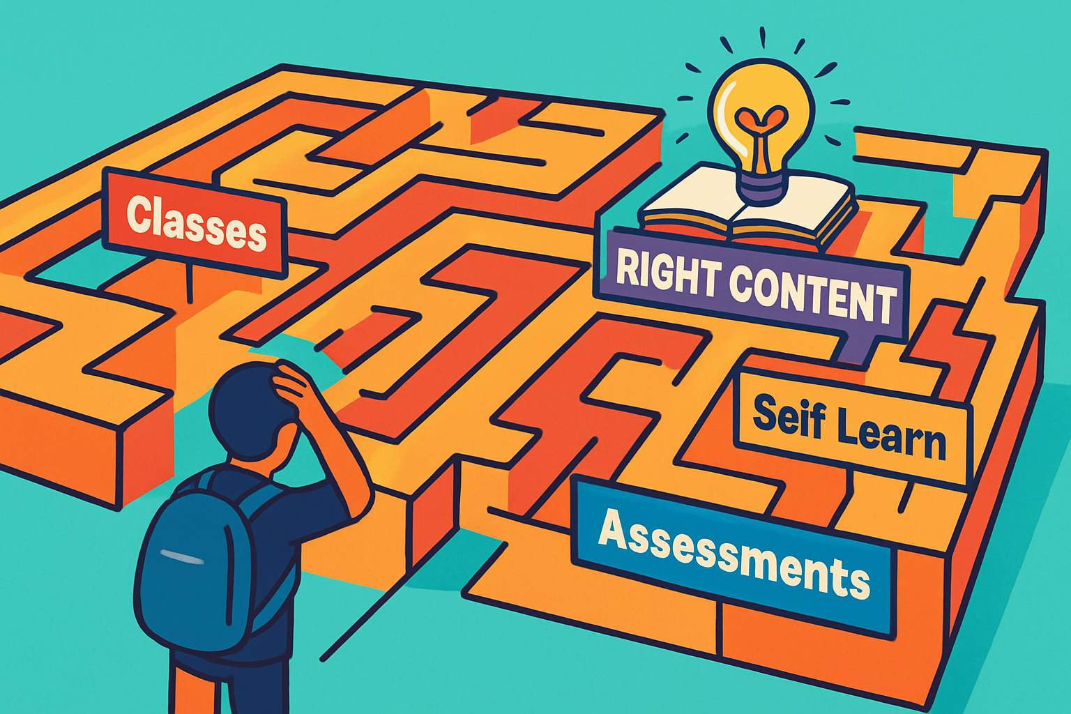
The Infinity Learn mobile and web apps have been in the market for over 2 years and more than 7 lakh learners have used it to access classes, practice, and self learning content.
The app is divided into modules that allows users to access content by its category - Classes (includes live and recorded classes with teachers), Self Learn (includes self paced videos, reading material, and practice tests), and Assessments (full length mock exams and test series).
When a user lands on the app, based on their goal, they proceed to a specific module and go through a structured data (often as filterable lists) to find the content to consume.
As a result of above processes, there were some major pain points for the user:
- The user has to put an effort to find the right content to consume, as a result the user spends considerable amount of valuable time into non-learning tasks
- Users who are not able to find the right content churn and due to the experience are not able to maximise the benefits of their subscription
My team took this challenge - the Search feature came out as the best solution post discussions. In the rest of the case study, I will highlight the whys and hows of this challenge.
My Role
I was assigned the Product Manager for this challenge.
My job was to ensure leadership alignments on the challenge, success metrics, and the solution. Prototype the solution with a designer, collect feedback with the prototype and finalise the product requirements. Then, connect with our developer team, reiterate and prioritise requirements based on the go to market plan. And finally test, track, and measure the success for each release.
Finalising the Solution
Search came out as the best solution mainly through the discussions with product, technology, and customer success teams. Secondary research on the existing products in the markets validated those discussions.
For this particular challenge only a small portion of useful inputs came through direct customer reviews and interviews.
Search turned out to be a no-brainer without heavy primary research mainly because:
- Search was already etched as a core consumer behaviour for every digital application - EdTech or otherwise. Specifically since we are catering to young students, who are extremely proficient with technology, Search is one of those features that our user persona would involuntarily look out for.
- The searchable data and filtering categories for each type of media were vast. The ability to Search was a long term investment given that Content is on of the primary pillar of our industry and the amount of media will be increasing in multiples over the coming years.
Success Metrics
Based on the problem to solve and the search solution - we devised following metrics to focus on.
- Conversion Rates: Users opting to Search → Users searching for something → Users engaging with content
- Time Spent on Navigation vs Time Spent on Learning
- Improvements in D30 Retention
Conversion Rates were our North Star because — Time Spent and Retention are totally dependent on users finding Search easy to use and helpful in terms of output quality.
So, CVR Quality of Results Ease of Use.
Quality of Content
The quality of results in turn was dependent on Context and Relevance of the output data to input query. So if a user types “magnetism” in the search bar, our feature should be able to decide the best content to be displayed based on the user’s grade, the exam they are prepping for, the subject they are intending to search for, and more such subjective understandings.
Other than subjectively understanding each user, it was important to generally be aware on what each cohort of users would prefer in terms of say media of content, or language, or if a particular teacher is popular.
The user persona were divided into multiple cohorts based on their grade-exam-board like combinations and nesting them into layers like subscribed or freemium usage.
Ease of Use
Here the focus was on UX. The vision was wireframed and iterated with insights from the design lead and other members of the team. Once a common ground was visible, we went into designing the screens for all viewports.
Some prominent discussions were on,
- how to introduce the feature to users (onboarding)
- how much search freedom is necessary (questions like whether to allow filtering/sorting and till what levels)
- how the feature will differ when accessed from different dashboards within the app
- how to autosuggest for character, word, multiple word inputs
- how to link other features like an AI tool to ask specific Doubts and more such topics.
The UI on the other hand was consistent with the design language and responsive for all devices in use.
Go to Market
We launched the feature phase wise with the most engaging media ‘Live Classes’ first followed by Recorded Classes, Video Content, Assessment and so on.
With each release we tracked metrics to identify unexpected behaviours and fix them.
Results
Success
The user conversion to the root educational content increased between 5% to 15% differing from dashboards to dashboards. Live Class dashboards experienced the best conversions.
Mistakes we made
- The user cohorts could have been better managed to ensure more relevant outputs based on if the content was free or paid.
- The feature would have been more impactful if it was timed to launch when the MAUs were the highest.